ページ

ラベル html5 の投稿を表示しています。 すべての投稿を表示

2016年5月28日土曜日

HTML5のCanvasでimgとcanvasを重ねて拡大鏡を作る


最近、HTML5のCanvas上で拡大鏡を作ることがあったのでそのメモです。

完成イメージ


まずは、完成イメージ↓
gif
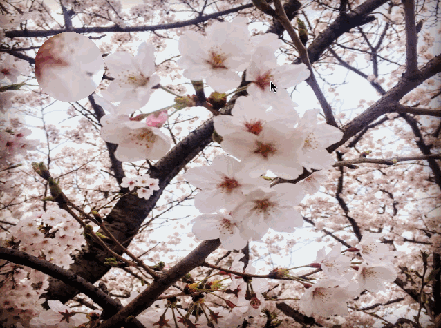
マウスの動きに合わせて拡大鏡が動きます。

実装


土台となるhtmlですが、imgの上にcanvasのレイヤーを重ねてます。
重ねる為imgにはz-index: 1;canvasにはz-index: 2;を指定し、
Z方向の位置を設定しています。
  • index.html
<!DOCTYPE html>
<html>
<head>
  <meta charset="utf-8">
  <title>loupe</title>
  <script type="text/javascript" src="canvas_loupe.js"></script>
  <script type="text/javascript" src="index.js"></script>
  <style>
    #container {
      position: relative;
    }
    #main_img {
      width: 640px;
      height: 480px;
      position: absolute;
      z-index: 1;
    }
    #loupe_canvas {
      position: absolute;
      z-index: 2;
    }
  </style>
</head>
<body>
  <div id="container">
    <img id="main_img" src="sample.jpg"></img>
    <canvas id="loupe_canvas" width="640" height="480"></canvas>
  </div>
</body>
</html>
次に実際の拡大鏡の処理を行うcanvas_loupe.jsです。
  • canvas_loupe.js
/**
 * canvas_loupe.js
 */

var loupe = {

  x: 0, // Current x.
  y: 0, // Current y.
  w: 0, // Image width.
  h: 0, // Image height.
  loupe_x: 50, // loupe x coordinate.
  loupe_y: 50, // loupe y coordinate.
  size: 50, // Crop size.
  zoom: 2, // Zoom rate.
  wide_size: 0, // Crop size * Zoom rate.
  image: null, // Image object.
  /**
   * Initialize.
   *
   * @param w Image width
   * @param h Image height
   * @param src Image src
   */
  initialize: function(w, h, src) {
    this.w = w;
    this.h = h;
    this.wide_size = this.size * this.zoom;
    this.image = new Image();
    this.image.src = src;
  },
  /**
   * Update coordinate.
   *
   * @param x
   * @param y
   */
  update: function(x, y) {
    this.x = x;
    this.y = y;
  },
  /**
   * Draw loupe.
   *
   * @param ctx context
   */
  draw: function(ctx) {

    var nx = (this.x * this.image.naturalWidth / this.w) - (this.size / 2);
    var ny = (this.y * this.image.naturalHeight / this.h) - (this.size / 2);

    ctx.save();
    ctx.beginPath();
    ctx.arc(this.loupe_x + this.wide_size / 2,
      this.loupe_y + this.wide_size / 2, this.wide_size / 2, 0, Math.PI * 2, false);
    ctx.clip();

    ctx.drawImage(this.image, nx, ny, this.size, this.size,
      this.loupe_x, this.loupe_y, this.wide_size, this.wide_size);
    ctx.restore();
  }
};
やってる事としては、、
  • initialize
    画像のsrcと画像の幅、高さを引数で渡して、メンバに保存してます
  • update
    x,yの座標位置(マウスの位置)を更新しています。
  • draw
    描画を行っている箇所です。まず
    var nx = (this.x * this.image.naturalWidth / this.w) - (this.size / 2);
    var ny = (this.y * this.image.naturalHeight / this.h) - (this.size / 2);
    ↑で実際の画像サイズと表示サイズを元に拡大鏡の描画位置を算出しています。
    次にclipを使って拡大鏡の丸い形でくり抜く処理を行ってます
    ctx.beginPath();
    ctx.arc(this.loupe_x + this.wide_size / 2,
      this.loupe_y + this.wide_size / 2, this.wide_size / 2, 0, Math.PI * 2, false);
    ctx.clip();
    最後に拡大した画像を表示させています。
    ctx.drawImage(this.image, nx, ny, this.size, this.size,
      this.loupe_x, this.loupe_y, this.wide_size, this.wide_size);
    先にくり抜く形を指定しclipしてからdrawImageすると指定した
    形で画像がくり抜かれて描画されます。
最後に拡大鏡の呼び出しやマウス位置更新の処理を行っているindex.jsです。
  • index.js
var ctx = null;

window.onload = function() {
  var canvas = document.getElementById('loupe_canvas');
  ctx = canvas.getContext('2d');

  canvas.addEventListener('mousemove', onMouseMove);
  loupe.initialize(640, 480, 'sample.jpg');

};

function onMouseMove(e) {
  loupe.update(e.clientX, e.clientY);
  loupe.draw(ctx);
}
マウス移動時onMouseMoveloupeを呼び出しています。

2015年2月6日金曜日

HTML5と戯れる 3 - 基礎 -

次の外勤先がWebアプリケーション(Struts)なので、とりあえず全て一から勉強(--;)

ドットインストールを見ながら基本的なHTMLのテンプレートを作成。

index.html

<!DOCTYPE html>
<html lang="ja">
  <head>
    <meta charset="utf-8">
    <title>Title</title>
    <style>
      p { color: red; }
    </style>
  </head>
  <body>
    <!-- comment -->
    <p>Hello, World!</p>
    <h1>h1</h1>
    <h2>h2</h2>
    <h3>h3</h3>
    <h4>h4</h4>
    <h5>h5</h5>
    <h6>h6</h6>
    <hr>
    <p><strong>strong</strong></p>
    <hr>
    <!-- Unordered List -->
    <ul>
    <li>Apple</li>
    <li>Banana</li>
    <li>Pie</li>
    </ul>
    <!-- Ordered List -->
    <ol>
    <li>Apple</li>
    <li>Banana</li>
    <li>Pie</li>
    </ol>
    <hr>
    <!--
      tr: table row
      th: table header
      td: table data
    -->
    <table>
    <thead>
    <tr>
    <th>id</th>
    <th>name</th>
    <th>age</th>
    </tr>
    </thead>
    <tbody>
    <tr>
    <td>1</td>
    <td>AAA</td>
    <td>25</td>
    </tr>
    <tr>
    <td>2</td>
    <td>BBB</td>
    <td>30</td>
    </tr>
    </tbody>
    </table>
  </body>
</html>

実行結果(safari)


ん〜基礎は大事。

2014年4月12日土曜日

HTML5と戯れる 2 - アニメーション -

前回作成した簡易時計ページに、アニメーションを付けてみました。

以下ソース

<!DOCTYPE html>
<html>
<head>
<!-- 画面サイズの横幅320pxで固定 -->
<meta name="viewport" content="width=320, user-scalable=no" />
<meta charset="utf-8" />
</head>
<body>
  <!-- デジタル時計の画面を指定 -->
  <!--
  <div id="disp" style="font-size:48px;text-align:center;"></div>
  -->
  <div id="clock">
    <div style="font-size:32px;">&nbsp;</div>
    <div id="anime1">●●●●●</div>
    <div id="disp">00:00:00</div>
    <div id="anime2">●●●●●</div>
  </div>
  <!-- 時計を表示するスクリプト -->
  <script type="text/javascript">
    setInterval(showTime, 500);
    function showTime() {

      var t = new Date();
      // 時間を表示する
      $("disp").innerHTML = t.getHours() + ":" +
        t.getMinutes() + ":" +
        t.getSeconds();

      // 簡単なアニメーションを行う
      var sec = t.getSeconds();
      var n = "", m = "";
      for(var i = 0; i < 5; i++) {
          n += (i < (sec%5)) ? "●" : "○";
          m += (i >= (sec%5)) ? "●" : "○";
      }
      $("anime1").innerHTML = n;
      $("anime2").innerHTML = m;
      // CSSのTransform機能を使ってDIV要素を回転させる
      var deg = Math.floor(360 * (sec / 60));
      $("clock").style.webkitTransform = "rotate(" + deg + "deg)";
    }
    // DOM要素を取得する
    function $(id) { return document.getElementById(id); }
  </script>
</body>

</html>

実際にブラウザ上で動かしてみた結果。。


なんかしょぼい?

2014年3月11日火曜日

HTML5と戯れる 1 - デジタル時計表示 -

結構前の日経ソフトウェアの付録?にHTML5アプリ開発があったのでちょっとやってみた。
とりあえず簡単なサンプルから試してみました。

<!DOCTYPE html>
<html>
<head>
<!-- 画面サイズの横幅320pxで固定 -->
<meta name="viewport" content="width=320, user-scalable=no" />
<meta charset="utf-8" />
</head>
<body>
  <!-- デジタル時計の画面を指定 -->
  <div id="disp" style="font-size:48px;text-align:center;"></div>
  <!-- 時計を表示するスクリプト -->
  <script type="text/javascript">
    setInterval(showTime, 500);
    function showTime() {
      var t = new Date();
      // 時間を表示する
      $("disp").innerHTML = t.getHours() + ":" +
        t.getMinutes() + ":" +
        t.getSeconds();
    }
    // DOM要素を取得する
    function $(id) { return document.getElementById(id); }
  </script>
</body>
</html>

簡易時計表示なるもの。
PC上のブラウザで見たもの


スマホ上で見たもの


あんまし画面の最適化の効果がよく分からない?
ということで次のサンプル

<html>^M
<head>^M
<meta charset="utf-8">^M
<title>Hello</title>^M
<meta name="viewport" content="width=device-width">^M
<link rel="stylesheet"^M
      href="http://code.jquery.com/mobile/1.0.1/jquery.mobile-1.0.1.min.css" />^M
<script src="http://code.jquery.com/jquery-1.6.4.min.js"></script>^M
<script src="http://code.jquery.com/mobile/1.0.1/jquery.mobile-1.0.1.min.js"></script>^M
</head>^M
<body>^M
<!-- ヘッダ部 -->
<div data-role="header" data-theme="e">
  <h1>Test</h1>
  <a href="jquery_sample.html" data-icon="home"
     data-iconpos="notext">Home</a>
  <a href="#add" data-icon="add">Add</a>
</div>
<!-- トップページの定義 -->^M
<div data-role="page" id="top">^M
<div data-role="header" data-theme="e">
  <h1>Test</h1>
  <a href="jquery_sample.html" data-icon="home"
     data-iconpos="notext">Home</a>
  <a href="#add" data-icon="add">Add</a>
</div>
  <div data-role="content">^M
    <div>こんにちは。今は、トップページです。</div>^M
    <a href="#sub" data-role="button">サブページへ</a>^M
  </div>^M
</div>^M
<!-- サブページ定義 -->^M
<div data-role="page" id="sub">^M
  <div data-role="header"><h2>サブページ</h2></div>^M
  <div data-role="content">^M
    <div>サブに来ました。</div>^M
    <ul data-role="listview" data-inset="true">
       <li><a href="#">バナナ</a></li>
       <li><a href="#">リンゴ</a></li>
       <li><a href="#">イチゴ</a></li>
    </ul>
    <a href="#top" data-role="button">トップへ</a>^M
  </div>^M
</div>^M
</body>^M
</html>

直接RaspberryPiにアップして編集したものを、各端末のブラウザで表示。
PC上のブラウザ


スマホ上のブラウザ


こう見ると、スマホ用に画面が最適化されているのが分かる。
今回jquery-mobileを試してみたが、色々おもしろそう〜な気がするw。